.png)
.svg)
Mocha Mousse is more than a paint color—it’s a mood. And when used intentionally, it creates depth without heaviness. Here’s how we’re embracing it in our design work:
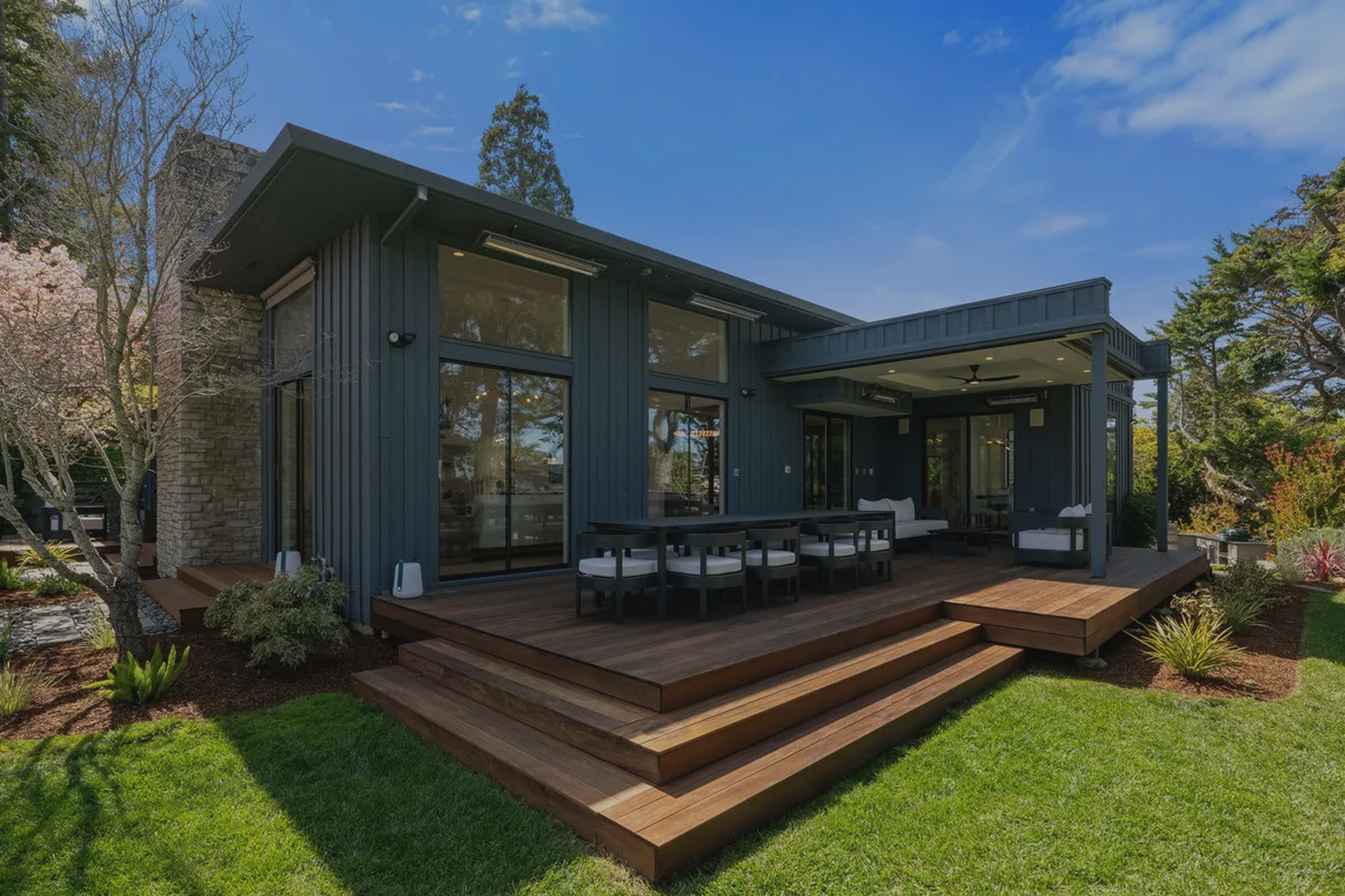
We’re especially drawn to it in transitional spaces—hallways, entryways, powder rooms—where it can anchor without overwhelming.
The homes we design are meant to evolve with you. That’s why Mocha Mousse is a shade we can get behind: it’s trend-aware without being trend-dependent.
This color supports the story of the space—it doesn’t try to steal the spotlight. And in our experience, those are the colors that stand the test of time. They let the architecture shine, the textures speak, and the homeowner’s personality lead.
Mocha Mousse is proof that power doesn’t always come from contrast or drama. Sometimes, the most impactful spaces are the ones that feel quiet, considered, and entirely at ease.
So if you’ve been craving a reset—something a little less busy, a little more balanced—this might be your color moment. Not because Pantone says so, but because your home deserves that kind of warmth.
Each year, the announcement of Pantone’s Color of the Year offers more than a color it
offers a cue. A pulse check on where the world is headed, and what we seem to need more of. In 2025, that need is clear: comfort, subtlety, and quiet sophistication. Enter Mocha Mousse. A gentle, grounded neutral, Mocha Mousse is the kind of hue that doesn’t fight for attention. Instead, it invites you in. It's soft without being sweet, rich without being overpowering. And in a design landscape often filled with bold declarations, this color speaks in a calm, assured voice.
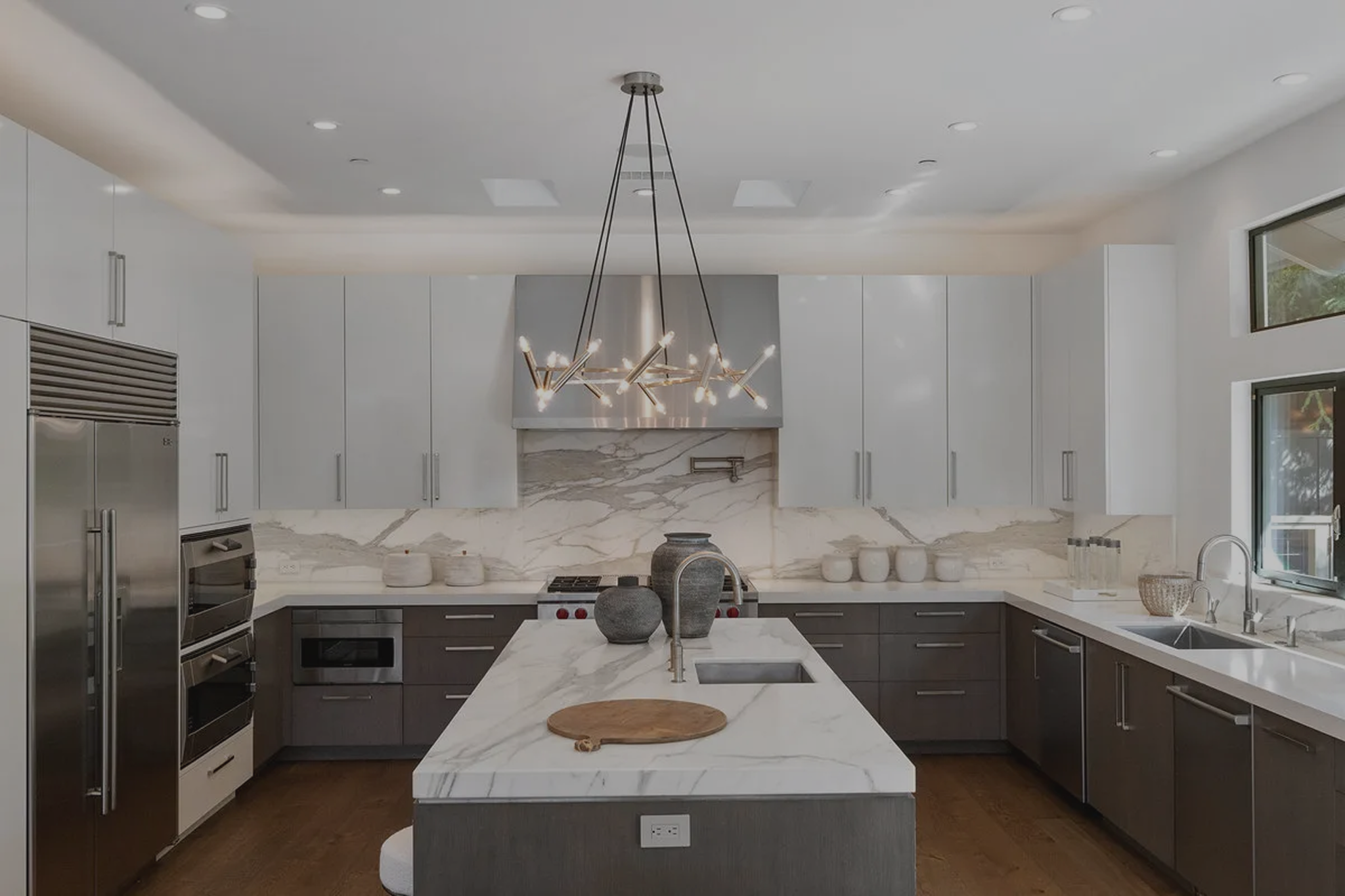
At first glance, Mocha Mousse might read as “safe” but don’t let the subtlety fool you. It’s the kind of foundational color that sophisticated design is built on. Warm and versatile, it layers beautifully with a wide range of tones, from creamy whites and natural woods to soft sage, dusty rose, charcoal, and even more daring tones like matte black.
It evokes what so many homeowners are craving now: serenity, warmth, and something that won’t feel dated in a year or two.