.png)
.svg)
Gone are the days of negotiating shelf space. Dual closet suites are becoming the standard in elevated homes—each tailored to the person using it. From bespoke shoe walls to island storage and dedicated dressing areas, these spaces are designed as personal sanctuaries within the shared.
Duality extends beautifully into the bathroom. Rather than simply installing two sinks, today’s layouts lean into separation: private entrances, individual vanities, personalized lighting, and spa-inspired details that reflect different tastes and routines—while still feeling harmonized.
With more people working remotely, we’re designing side-by-side workspaces that serve different working styles. One office might lean into quiet minimalism, while the other reflects a love of books, warmth, and layered textures. Different needs, shared structure.
We’re also seeing this layered into primary suites with adjacent lounges, reading alcoves, or personalized morning bars. It’s less about symmetry and more about intention—creating space for individual routines and rhythms while maintaining a cohesive design story.
At its core, duality in design is about respect—for each person’s preferences, needs, and flow. It signals a deeper understanding of how we live together, and the simple truth that sometimes, together doesn’t have to mean identical.
It’s not about more space. It’s about better space.
Whether we’re remodeling a historic home or designing something new from the ground up, we always ask: How can we make this feel good for both of you—individually and together?
That’s where the luxury lives. Not in the excess, but in the elegance of thoughtful distinction.
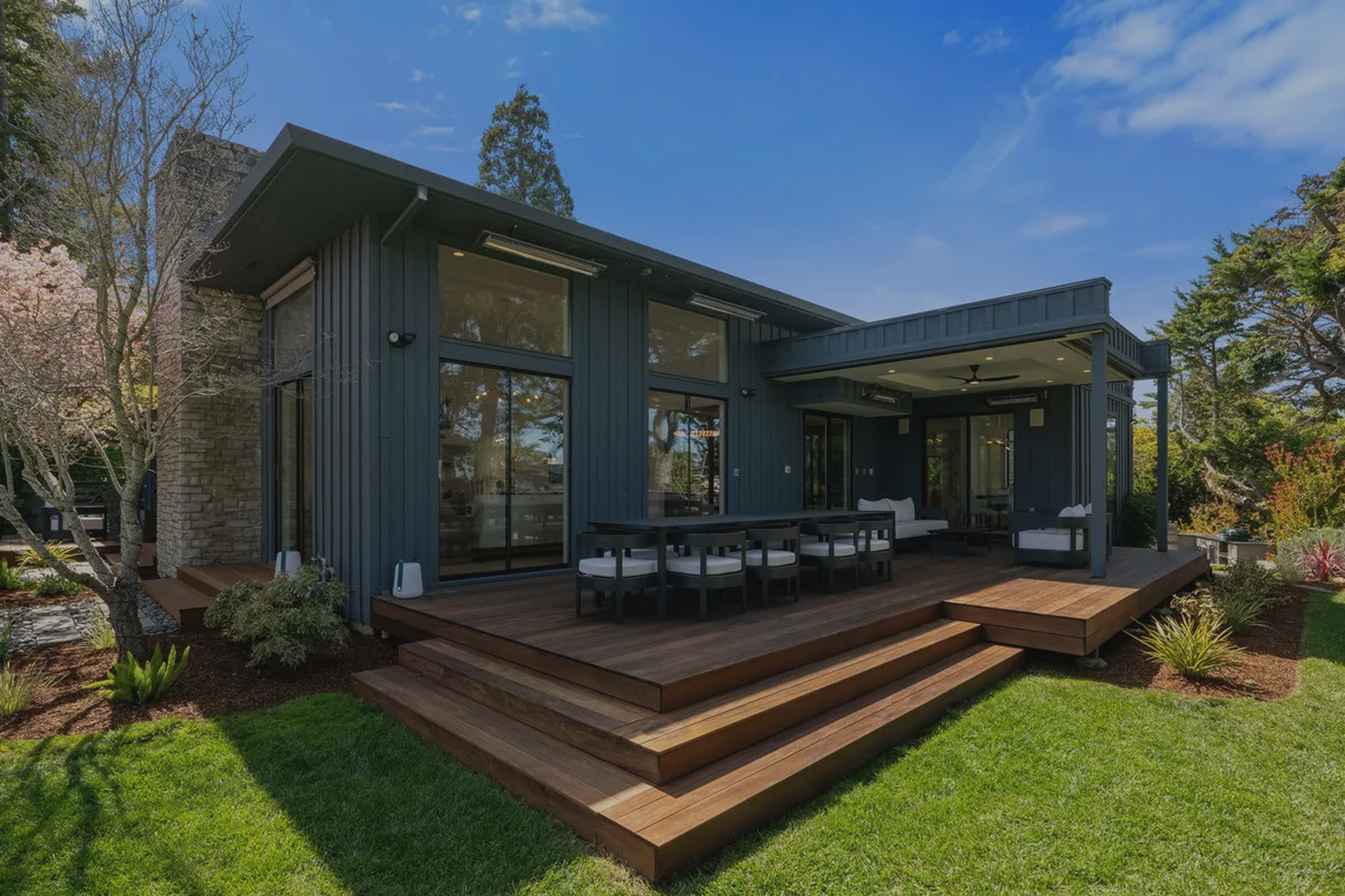
Once reserved for matching sinks or side-by-side garage bays, the concept of dual living has evolved into something far more sophisticated. In today’s luxury homes, we’re seeing a growing embrace of duality, designing with two distinct users in mind, without sacrificing cohesion, elegance, or intention.
It’s not about division. It’s about distinction. And when done well, it’s a powerful reflection of how people actually live.